

Madrid is a welcoming city, and it wants the welcome it extends to its visitors to be one of its main brand attributes, particularly insofar as tourism is concerned.
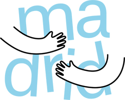
The primary element of this new design for Madrid’s icon is the quintessential symbol of hospitality and welcome: an embrace.
This summer’s major cultural and leisure events, Gay Pride, Mad Cool Festival and Veranos de la Villa Festival, will be the first events to publicise this new icon.
If the city of Madrid has one unmistakable attribute that defines it and distinguishes it from other cities, that is its hospitality and its capacity to welcome visitors from near and far. This intangible quality, popularly accepted by the whole of Madrid society, has inspired the design of the capital’s new graphic icon, developed by the Tourism Department of Madrid City Council.
Just as there are physical icons that represent the cities they stand in, certain intangible icons also dramatically reinforce a city’s brand, understood as the values and attributes that one associates with that city. Paris, for example, is the city of love, New York, the city that never sleeps, Rome, the eternal city… Madrid is a welcoming city, and it wants the welcome it extends to its visitors to be one of its main brand attributes, particularly insofar as tourism is concerned.
This new graphic icon is intended to simply and quickly conjure up the hospitality of Madrid and its capacity to welcome all comers, thereby helping to strengthen the brand of Madrid. This new design integrates the quintessential symbol of the city’s hospitality, an embrace. A universal language that crosses borders and is undoubtedly the best way to associate Madrid to these values. Madrid is a city that makes everyone feel at home. The welcoming nature of the people of Madrid allows them to make every visitor to Madrid feel that they belong here right from the moment they arrive, no matter who they are or where they come from. That is why, in this new iconography, the word Madrid hugs and wraps its arms around itself to put a clear message across: Madrid embraces you.
This icon, dreamed up by the agency Erretres, The Strategic Design Company, is not intended to be a mere institutional brand or a corporate logo for Madrid City Council, rather to become an open symbol that represents the entire city and that the city makes its own.
Dissemination of the new graphic icon
The dissemination of the city’s new graphic icon is about to begin, and it will coincide with this summer’s major cultural and leisure events in Madrid: LGBTI Pride, Mad Cool music festival and Veranos de la Villa Festival. During July, August and September it will also be highlighted by advertising on urban furniture and other projects.
After the summer, the Tourism Department of Madrid City Council intends featuring the new graphic icon in its different promotional channels, such as its official tourism website esMADRID.com and esMADRIDmagazine, as well as its social networks and national and international advertising campaigns.
The project includes the production of promotional and communication material, new leaflets, guides and flyers, and updating the design of the Council’s tourist information points and centres. Its communication channels are also going to be updated and redesigned, as are its audiovisuals and graphic elements, its advertising campaigns in the major markets, including Spain itself, the development of digital campaigns in social networks and online media, and the sponsorship of events and activities that are of interest to tourists.
Tourism Action Plan
This new tourist iconography of the city of Madrid will replace the logo ¡MADRID!, which used to be the institutional logo of the Council, although they ceased using it in 2016. The creation of this new iconography is also a response to needs that were identified in the Tourism Action Plan of the city of Madrid 2015-2019, which recommends strengthening the tourism brand and generating icons of the city to highlight qualities and attributes that distinguish it from other destinations. Given this scenario, and faced with the need to update the corporate identity of the Council’s Tourism Department, the decision was taken to create this new graphic icon that reinforces one of the city’s most defining qualities./
embrace icon madrid tourism
